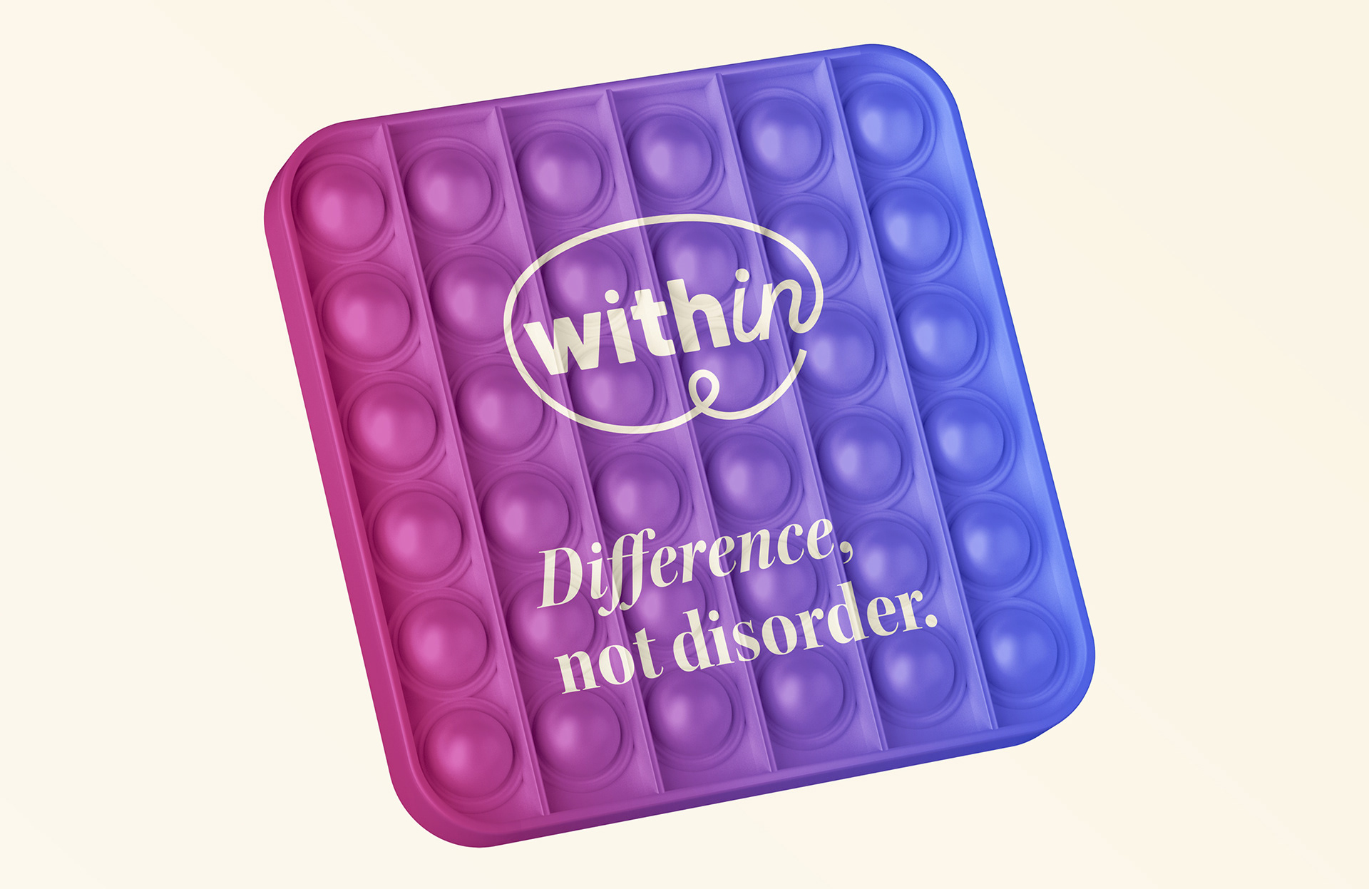
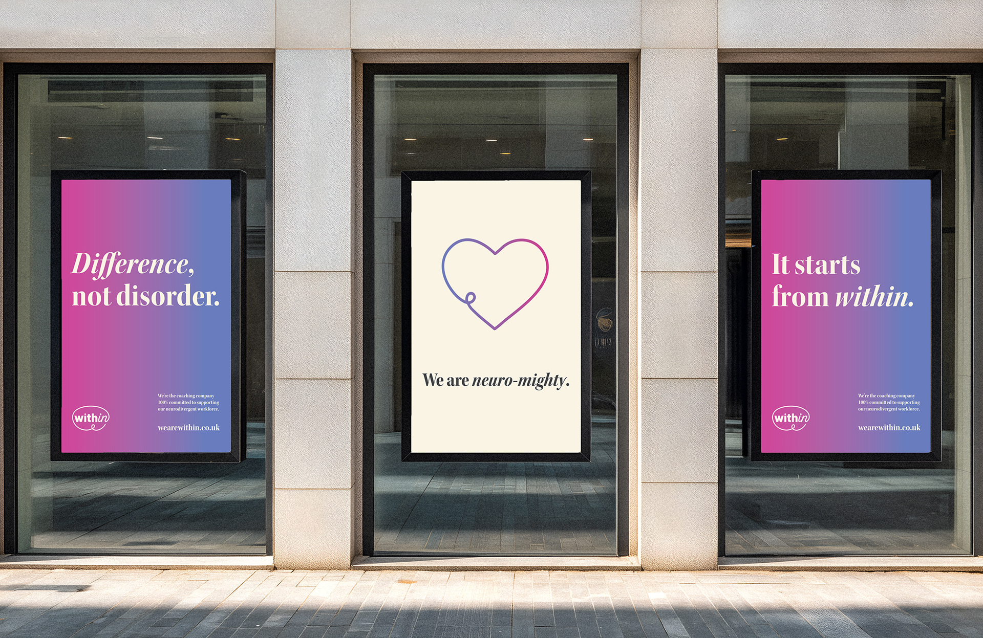
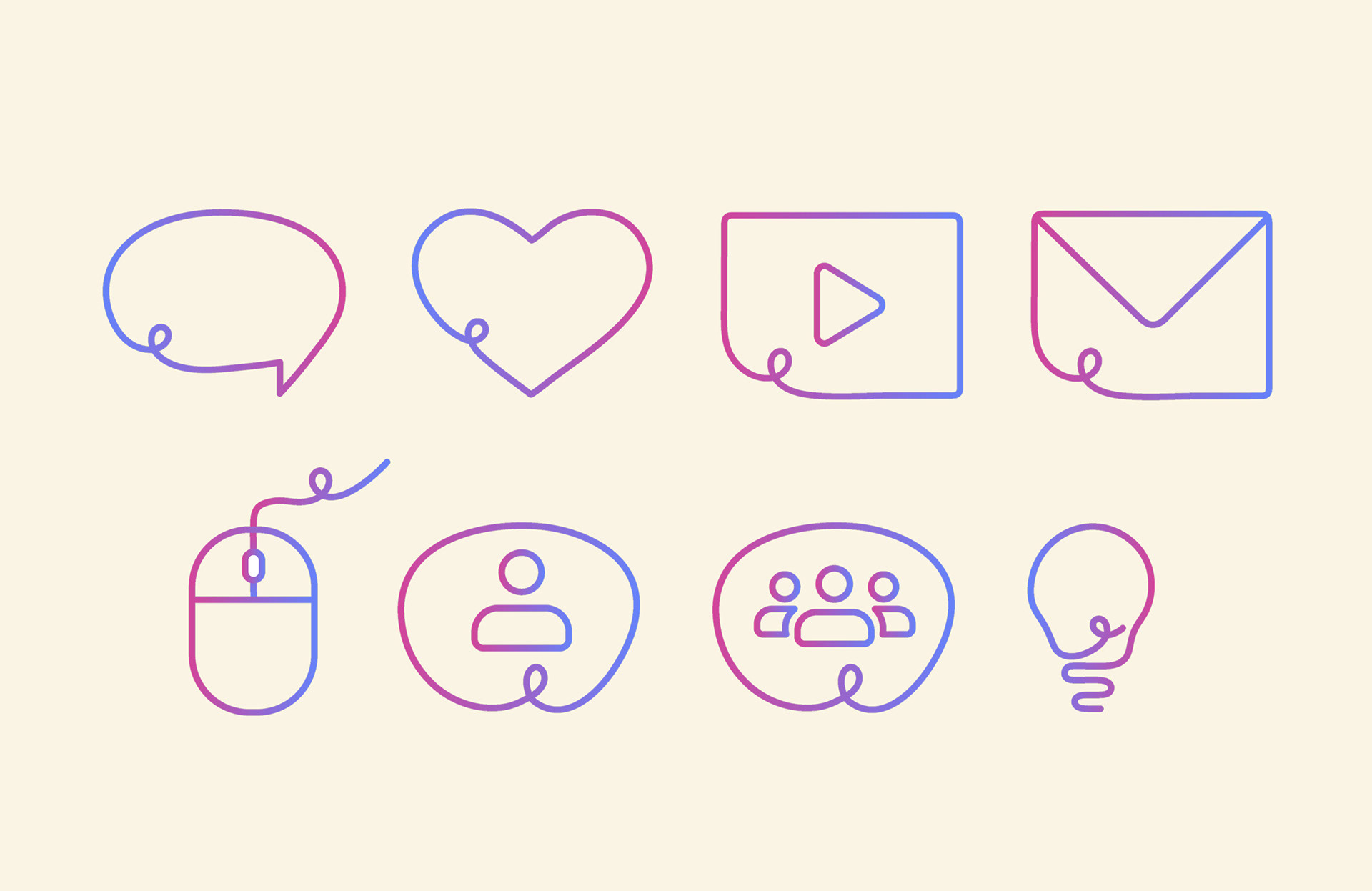
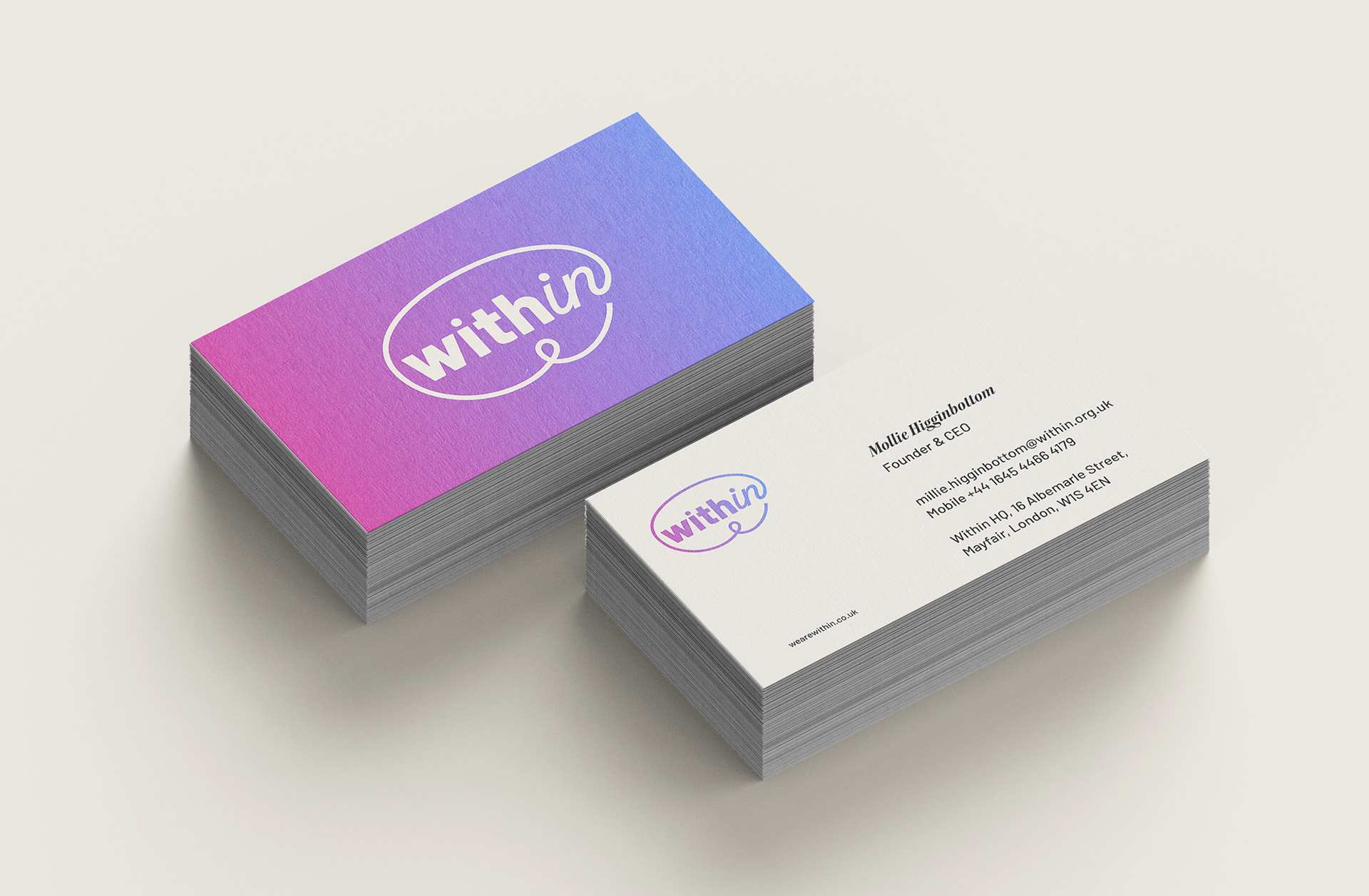
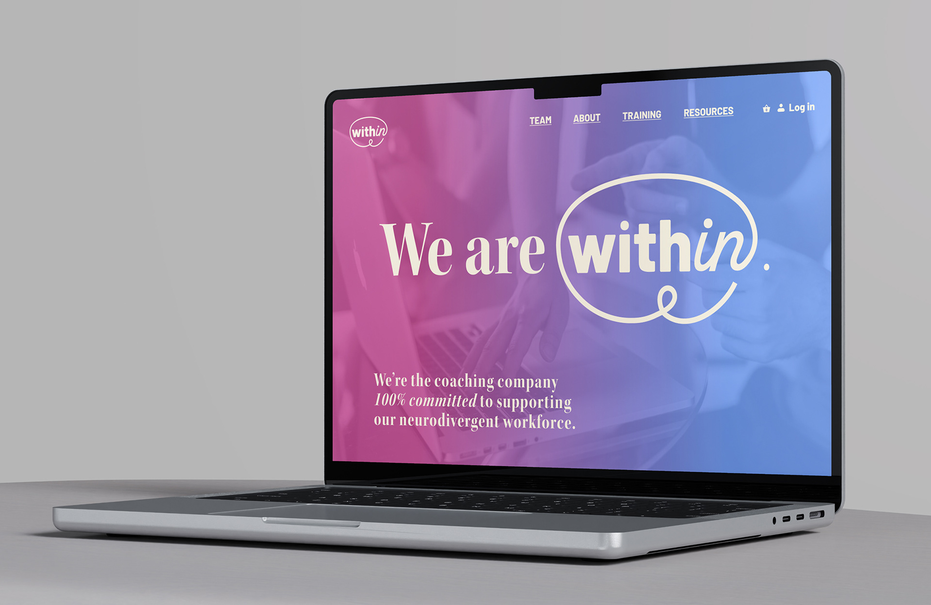
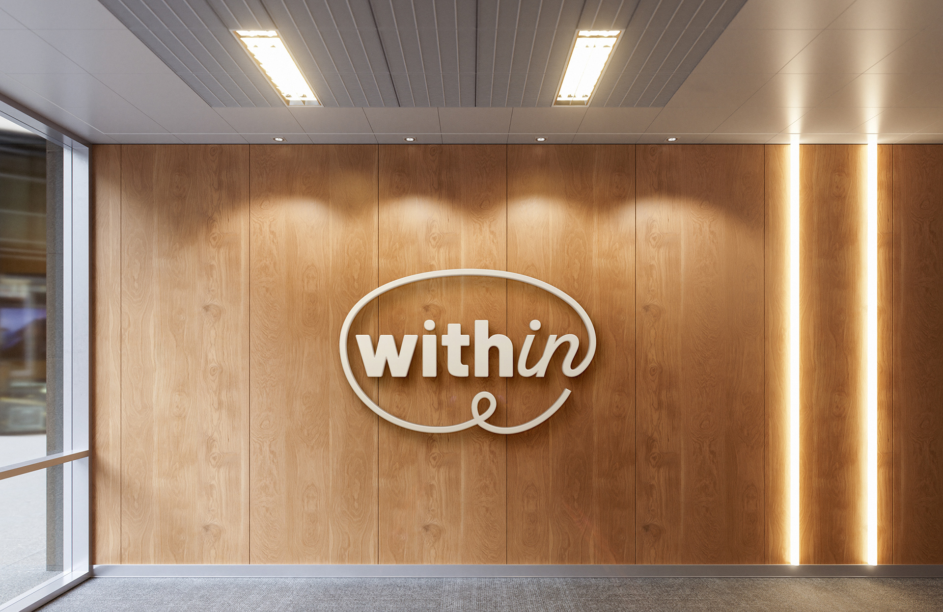
Within is a new neurodiversity coaching company designed to both stand out in a corporate setting and to avoid any commonly used visual cliches. The word-mark uses two contrasting typefaces encapsulated by a swoosh and sits against a gradient background to reiterate the concept of inclusivity. The logoform gently and subtly references a brain form, and the loop is a nod to different and interesting ways of working and how many neurodivergent individuals have untapped talents. This has informed the basis of a complete set of icons.